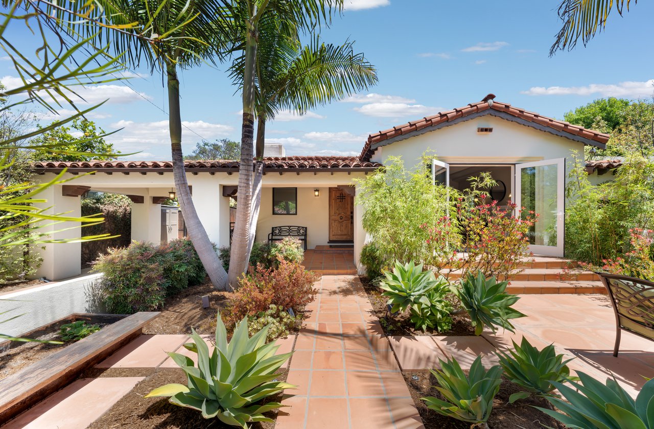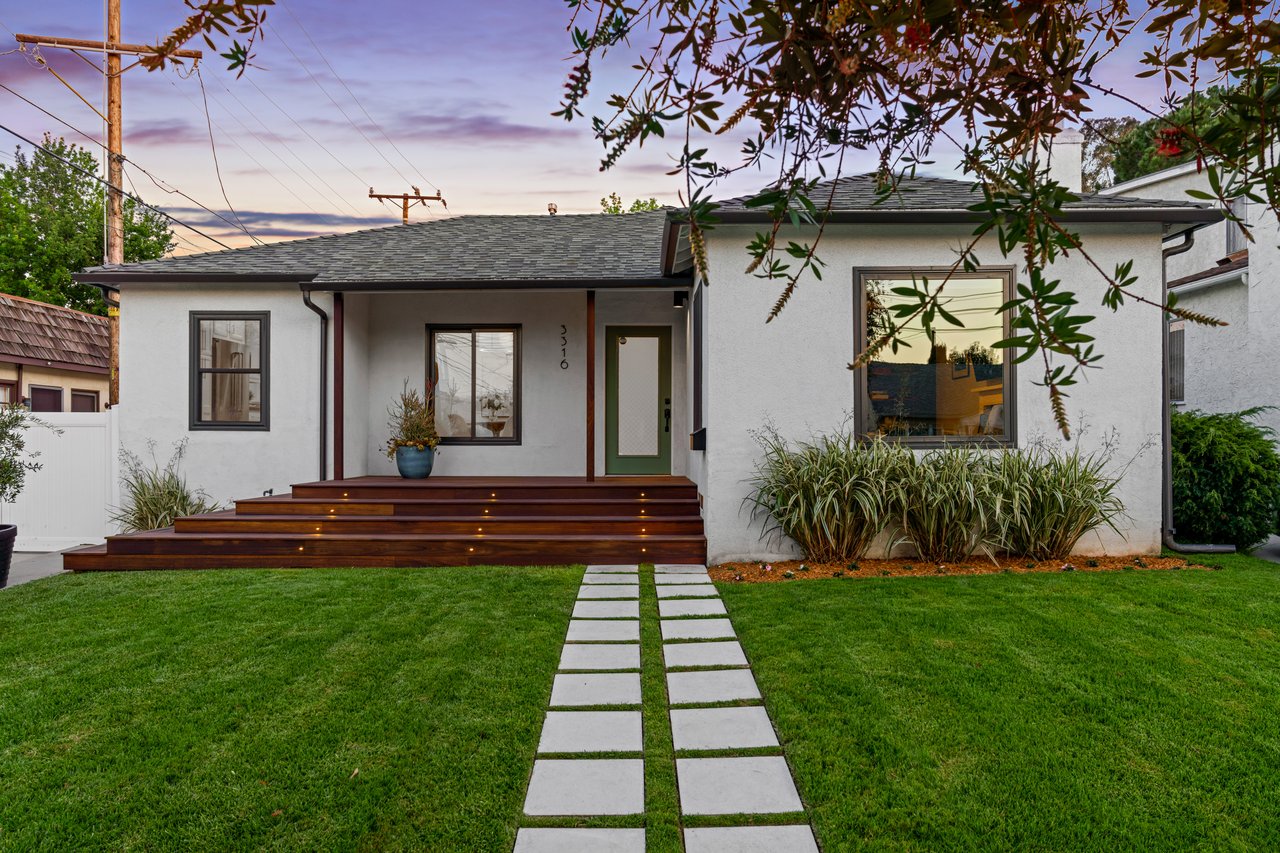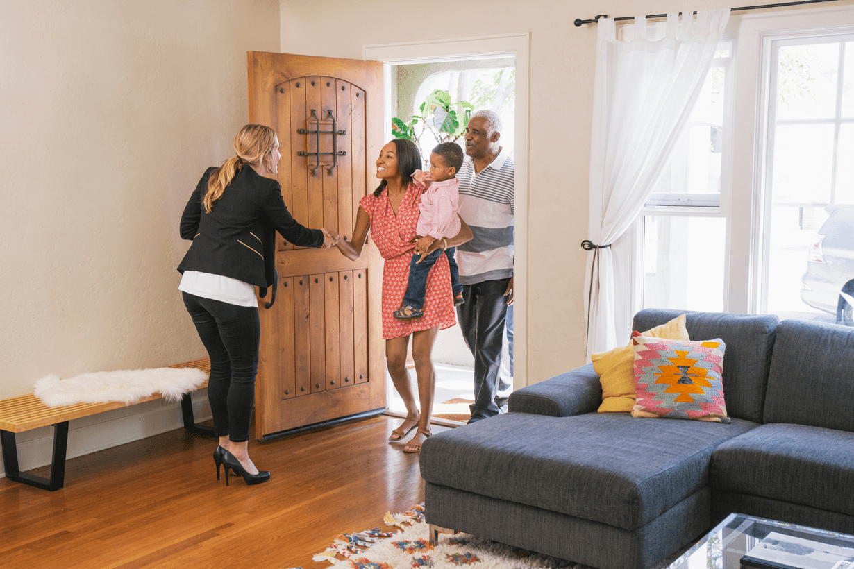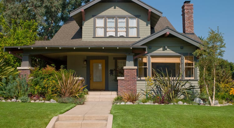
It depends on the goal. Is the color being chosen for the people who live there, or with a future sale in mind?
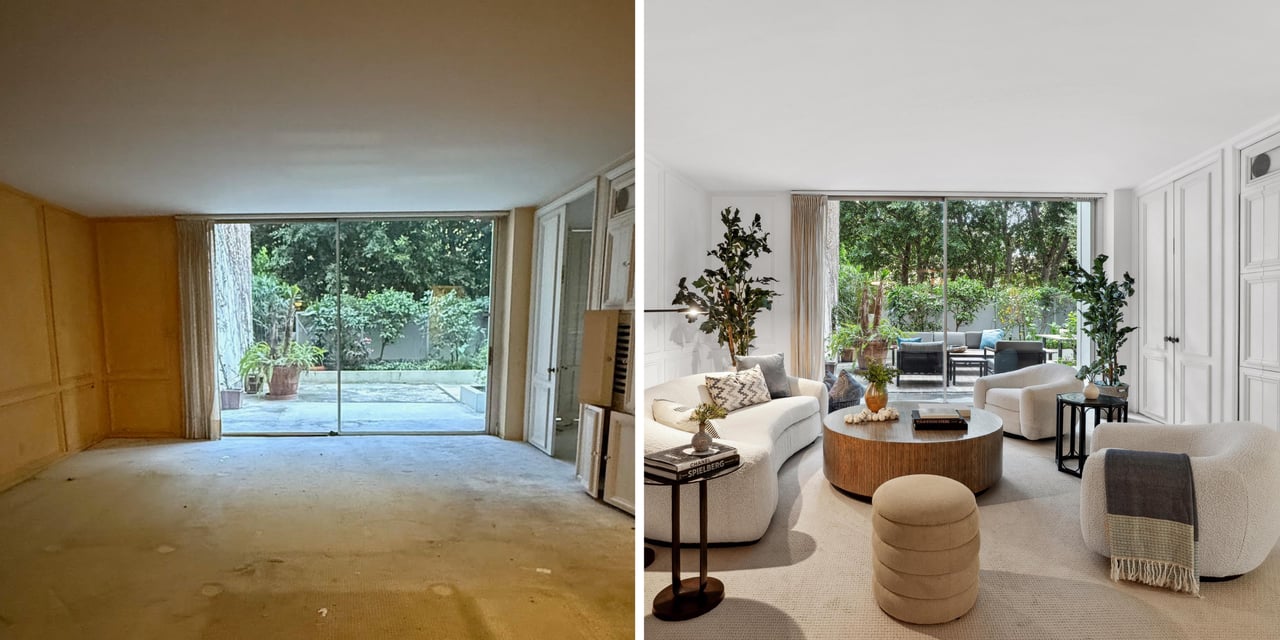
Neutrals and whites are often treated as safe choices, but even those are not simple. There are hundreds of whites, each with a different undertone. trends change, and personal preferences differ. A color that looks good on a sample may look completely different once it covers an entire wall.
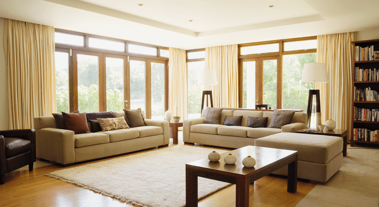
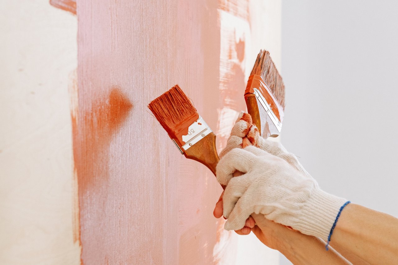
We have made some of those paint mistakes ourselves. A color can look good in the store and turn gray, pink, or yellow once it is in the room. North-facing rooms tend to have cooler light, while south- and west-facing rooms often make colors appear warmer. Flooring, stone, cabinetry, wood finishes, and furniture also affect how paint looks on the wall. For that reason, our best advice is to test large samples in the actual room and view them at different times of day.
Can Color Make a Room Feel Larger?
Usually. Lighter colors reflect more light and can make a room feel more open. Soft whites, pale blues, muted greens, and light taupes often work well, particularly when there is not a sharp contrast between the walls and trim. But bright white is not always the best choice. In a room with limited natural light, it can look cold, flat and too sterile to create the desired mood.
Nor are dark colors automatically wrong for small rooms. Navy, olive, brown, or charcoal can work well in a powder room, office, dining room, or bedroom. Using the same color on the walls, trim, and doors can reduce visual breaks and make the dimensions of the room less noticeable.
Where Color Trends Are Moving
Color forecasts for 2026 are leaning warmer, moving away from the grays that dominated interiors for much of the past decade. Browns, khakis, clay tones, muted greens, softer blues, and warmer whites are becoming more common, but the trend is not simply toward darker colors. Designers are also using more variation from room to room instead of carrying the same pale neutral throughout an entire home.
Choosing Color Before a Sale
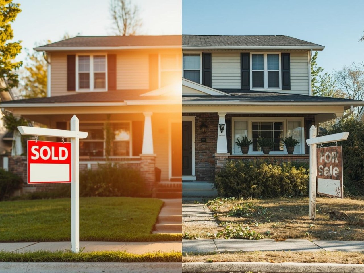
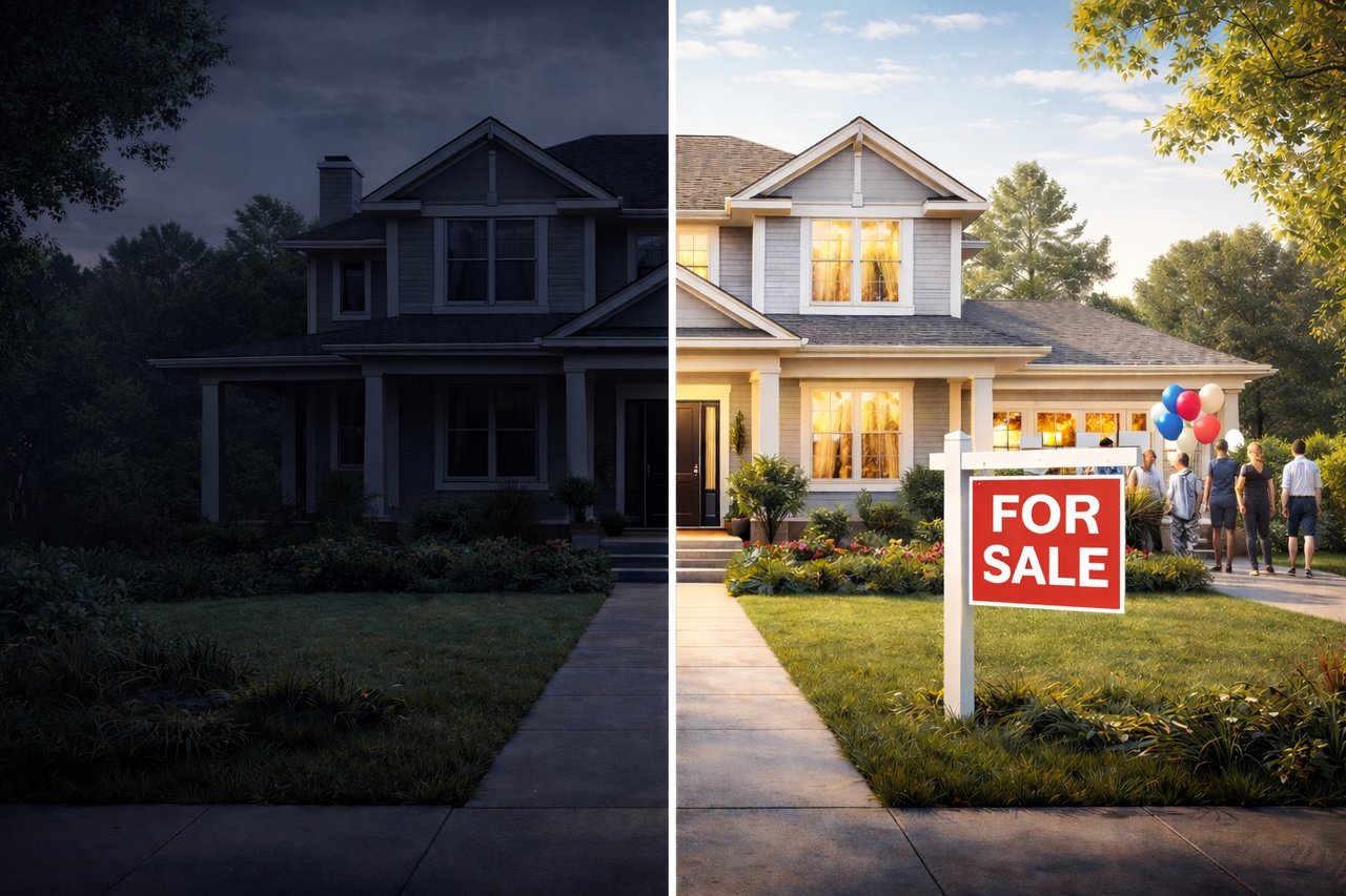
For homeowners who expect to remain in their home for many years, we think personal preference should lead the decision. When a sale is likely within the next year or so, it makes sense to consider how the color will look to buyers and in listing photography.
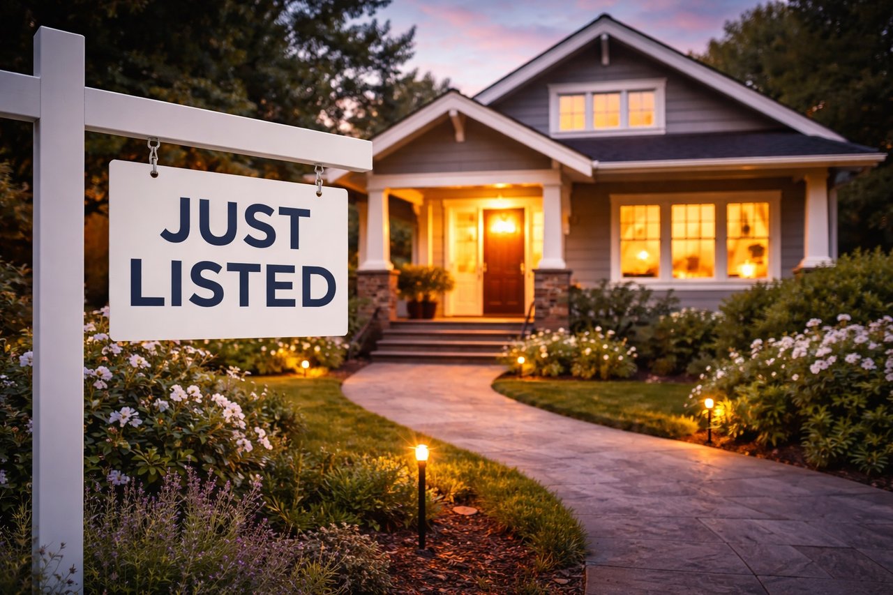
With resale in mind, saturated yellows and ochres can cast a yellow tint in photographs or make a room appear darker. Very dark tones can also overwhelm a room, particularly when they do not work with the natural light or existing finishes. If there is uncertainty, a more restrained color may be the safer choice, or a professional color consultation may be worthwhile before repainting several rooms.
While we are not interior designers, years of preparing homes for sale have given us plenty of experience with what works and what does not. We are always happy to offer our perspective when a future sale is part of the decision.
Your Trusted Advisors,
Peter and Tregg
Copyright © 2025–2026 Peter Maurice and Tregg Rustad. All rights reserved. Unauthorized use, reproduction, or distribution of this content is prohibited.